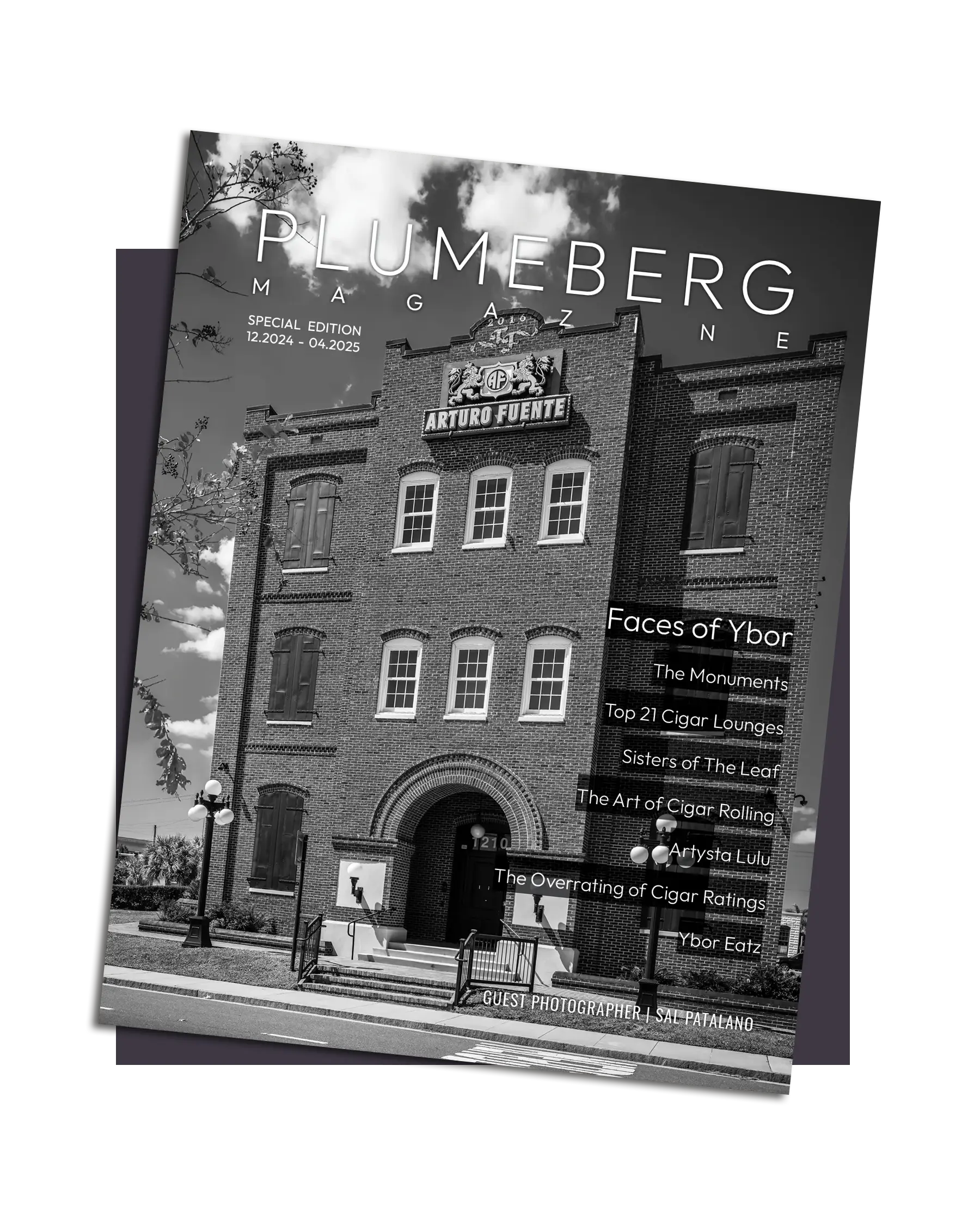
Magazine Design
Designing Ybor
A Modern Ode to a Historic Neighborhood
Creating this magazine was a deeply personal and creatively fulfilling experience. As someone whose office is based in Ybor City, I don’t just design in this neighborhood, I live it every day. I walk its brick-lined streets, hear the chickens clucking on the way to the office, and feel the textured history in the architecture that surrounds me. When the opportunity came to design a black and white magazine dedicated to the architecture and people of Ybor, I knew I wanted to do more than create a layout. I wanted to create a vessel that carried the story of the city without getting in its way.
This magazine is, in many ways, a love letter to Ybor. But it’s not one written in elaborate flourishes or ornate typographic displays. It’s written in restraint. In space. In trust. Trust that the subject — the weathered walls, the soulful eyes, the iron and shadow — can speak for itself. My design philosophy for this project was simple: let Ybor shine.
Please allow sufficient time for pages to load – the large amount of imagery in this piece makes it less web friendly than I’d like.

Aa
&
Typography: Clean, Grounded, and Unobtrusive
The type choices were guided by a desire for clarity and tone. I selected a single modern sans-serif for both headlines and body text with clean lines that contrast the historical and emotinal images without overpowering. This neutral sans-serif offers easy readability and visual contrast. There are no excessive stylistic flourishes. Hierarchy is established through weight, size, tracking, and proximity, not decoration.
The typography remains consistent throughout the magazine. This consistency reinforces the rhythm of the piece and allows the viewer to move comfortably from one section to the next, whether reading a brief caption or engaging with a 900-word feature.

Grid and Layout: Structured for Storytelling
The magazine follows a tight grid system that offers both structure and flexibility. Most pages are laid out with generous margins and white space, giving the imagery and text room to breathe. Full-bleed photos are used sparingly and purposefully, either to immerse the reader fully into a scene or an idea.
I often employed asymmetry to mirror the character of Ybor itself — balanced, but not perfectly neat. Some photo spreads bleed off one edge while maintaining margin on the opposite side, creating visual tension and energy that feels alive. Captions are placed carefully, often off to the side or beneath the photos, never overlapping or disrupting the image.
In sections featuring portraits of Ybor residents, I leaned into rhythm and silence. Though some spreads include just a single line of text, most have none at all, allowing the subject’s gaze to speak louder than any copy could.
Letting the City Breathe
What makes Ybor so remarkable is its coexistence of history and humanity. The decaying beauty of a cigar factory wall. The elegance of wrought iron silhouetted against a cloudy sky. The lived-in expression of a lifelong resident who’s seen it all. I designed this magazine to hold space for those things.
It’s easy in design to want to add — to embellish, decorate, refine. But with this project, I practiced subtraction. If something didn’t serve the image or the story, it didn’t stay. That restraint became its own kind of language. And in that quiet, I believe, the voices of Ybor, past and present, come through more clearly.
